
Table of Contents
What Is a Lead Capture Page?
Why Lead Capture Pages Matter for B2B Lead Generation
Key Elements of a High-Converting Lead Capture Page
Lead Capture Page Best Practices That Actually Move Conversions
How to Build a Lead Capture Page (Step-by-Step)
Lead Capture Page Examples Worth Studying
Lead Capture Page Templates to Get Started Faster
How Cleverly Uses Lead Capture as Part of a Full B2B Lead Generation System
Conclusion
Modified On :
June 30, 2026
Key Takeaways
- A lead capture page works because it strips away every distraction except one offer and one action, unlike a homepage that's trying to do ten jobs at once.
- Matching your page headline to the exact ad, email, or LinkedIn message that brought someone there is one of the fastest ways to lift conversions.
- Form length should match intent: shorter forms pull in volume, longer forms filter for quality, and you pick based on what your sales team can actually follow up on.
- Building the page is only half the job. The traffic you send to it determines whether your "high-converting" page actually converts anything.
- Test one variable at a time (headline, CTA, form length) instead of redesigning the whole page every time conversions dip.
The median landing page converts at just 4-6.6%, but the top quartile hits 11% or higher. Same traffic, same budget, completely different outcome.
The difference almost never comes down to the product or the offer. It comes down to whether the page was actually built to capture a lead or just thrown together because someone needed somewhere to send an ad.
We've watched this play out across thousands of B2B campaigns. A team spends weeks on targeting, writes a sharp cold email, gets a great open rate, and then sends that warm click to a homepage with six nav links and three competing CTAs. The lead walks. Not because they weren't interested, but because the page gave them too many ways to leave and not enough reason to act.
There's also a speed problem most teams underestimate: companies that respond to a new lead within 5 minutes convert at 8x the rate of those that wait an hour. That clock starts the second your capture page does its job, which means the page itself is the first domino in your entire follow-up process.
This guide walks through what actually makes a lead capture page convert: the core elements, the build process step by step, real examples broken down by what makes them work, and templates you can adapt instead of building from a blank page.
What Is a Lead Capture Page?
Most landing pages don't fail because of bad traffic. They fail because they were never built to capture anything in the first place.
A lead capture page is a standalone web page with exactly one job: collect a visitor's contact information in exchange for something they actually want.
No menu to click away to, no five other links competing for attention, no "learn more about our company" sidebar pulling focus. Just an offer, a form, and a reason to act now.
That's the part people get wrong. They build landing pages that try to inform, sell, and capture all at once. A real capture page does one of those things. Three-field forms convert at 10.1% compared to 3.6% for nine-field forms, and that gap exists almost entirely because of focus, not design polish.
Lead Capture Page vs. Landing Page vs. Homepage
People use these terms interchangeably and that's where the confusion starts.
If your page has a header menu linking to five other pages, it's not a capture page. It's a landing page wearing a capture page's clothes.
What typically lives on the page:
- A headline that states the offer plainly
- A form (name, email, sometimes phone or company)
- A single, specific CTA button
- Optional social proof (testimonial, logo strip, stat)
Common lead magnets that drive the offer:
- Free guides or templates
- Webinar registrations
- Free trial signups
- Demo or strategy call requests
- Checklists and swipe files
Single-purpose pages consistently beat general pages because removing choices removes hesitation. Every additional link or menu item is a chance for the visitor to leave before they convert.
📊 Better Data = Better Meetings
We enrich, verify, and target the right prospects—helping clients generate 15–30 qualified meetings every month.
Why Lead Capture Pages Matter for B2B Lead Generation
Every campaign you run needs a landing spot. Cold email, LinkedIn outreach, paid ads, it doesn't matter, the click has to go somewhere. Send it to your homepage and you've just handed the visitor an exit ramp before they ever see your offer.
A dedicated capture page removes that risk. There's nowhere else to go, so the visitor either converts or leaves, and you can measure exactly which campaigns produce which result.
Why this matters more in 2026 than it used to:
Speed to lead has become the single biggest lever in the whole funnel. B2B sites responding to inquiries within 5 minutes convert leads at 8x the rate of teams that wait an hour.
A capture page is what starts that clock. If your form submission lands in a shared inbox nobody checks until tomorrow, the page design never mattered.
Capture pages also give you something a general site can't: clean attribution. When a page exists for one campaign and one offer, you know exactly which channel, message, and audience produced the lead. That makes it possible to A/B test headlines, retarget people who didn't convert, and report pipeline back to the campaign that generated it, something that's nearly impossible when every campaign dumps traffic into the same homepage form.
The median dedicated landing page now converts at roughly 4-6.6% depending on industry, nearly double the rate of general website pages. That gap is the entire argument for building dedicated pages instead of recycling your homepage for every campaign.
Key Elements of a High-Converting Lead Capture Page
A good capture page isn't complicated. It's usually six or seven elements, each doing one job well.
Headline and Subheadline
Your headline needs to answer "what do I get" in under five seconds. Visitors read the headline and the first sentence of the subhead, then decide whether to keep going. That's the entire decision window.
The Offer Itself
This is the part teams skip past too fast. A weak offer with great design still underperforms. A strong, specific offer with mediocre design will outperform it every time. "Free Guide to B2B Sales" is weak. "The Cold Email Subject Line Swipe File We Use for 10,000+ Client Campaigns" is specific, credible, and tells the visitor exactly what they're getting.
Form Length
This is a tradeoff, not a universal rule:
- Name + email only: more submissions, lower qualification, good for top-of-funnel content
- Name, email, company, role: fewer submissions but higher intent, better for demo or strategy call requests
- Anything beyond 5-7 fields: only justified for high-ticket B2B offers where the visitor expects to qualify themselves
CTA Button Copy
"Submit" tells the visitor nothing. "Send Me the Swipe File" or "Book My Strategy Call" tells them exactly what happens next. Action-oriented, specific CTA copy consistently beats generic button text.
Social Proof
Logos alone don't do much without context. A line like "Trusted by 10,000+ B2B companies including teams at Amazon, Google, and Uber" does more work than a logo strip with no framing, because it pairs recognizable names with a number that signals scale.
Minimal Navigation, Above-the-Fold Focus
No header menu. No footer links to other pages. The offer and CTA need to be visible without scrolling, because a large share of visitors never scroll past the first screen.
🚀 Stop Prospecting With Incomplete Data
10,000+ businesses trust Cleverly to turn accurate data into predictable pipeline through done-for-you outbound campaigns.
Lead Capture Page Best Practices That Actually Move Conversions
Small changes can have a big impact on conversions. Follow these proven best practices to create lead capture pages that attract, engage, and convert more visitors.
Match the Page to the Traffic Source
If your cold email says "see how we book 20 meetings a month," your landing page headline better say something close to that exact phrase. Message match between the click and the page is one of the cheapest, highest-impact things you can fix. Mismatched messaging is the fastest way to spike your bounce rate.
Keep Forms Short for Volume, Longer for Intent
Don't default to "shorter is always better." If you're running a TOFU content offer, keep it to name and email. If you're running a BOFU demo request, asking for company size or role upfront actually helps your sales team prioritize who to call first.
Use Specific, Benefit-Driven CTAs
Replace "Submit" everywhere. Use outcome language: "Get the Template," "Start My Free Trial," "Book My Call." Specific, benefit-driven CTAs consistently outperform generic alternatives because they restate the value right at the moment of decision.
Add Social Proof Strategically
Order matters. Lead with a short kicker line, follow with the benefit headline, then drop the evidence (a stat, a logo row, or a short testimonial) right near the form. Specific results beat vague claims every time. "Helped 10,000+ B2B companies generate $312M in pipeline" lands harder than "trusted by many businesses."
Optimize for Mobile
Mobile traffic now makes up well over half of B2B web traffic, but converts at roughly half the rate of desktop, mostly because forms are clunky on small screens. Big buttons, short forms, no horizontal scrolling. If someone has to pinch and zoom to read your headline, you've already lost them.
Remove All Exit Points
No header nav. No footer links. No "related articles" section. The only way off the page should be converting or hitting the back button.
Test Continuously
A/B test one variable at a time: headline, CTA copy, form length, or offer framing. Even a small CTA copy change can shift conversion rates meaningfully, and you'll never know which lever moved the needle if you change five things at once.
How to Build a Lead Capture Page (Step-by-Step)
Most "how to build a landing page" guides give you a checklist that could apply to literally any page. That's not useful when you're trying to hit a specific conversion number. Here's the version with the decisions that actually move the needle at each step.
Step 1: Define the Offer and the Single Outcome You Want
Before touching any tool, write one sentence: "This page exists so that [specific person] gives us [specific info] in exchange for [specific thing]." If you can't fill that in cleanly, you don't have an offer yet, you have a vague idea.
Be brutal about specificity here. "Free guide to outbound sales" is not an offer. "The exact cold email sequence we used to book 30 meetings in 30 days" is. The more specific the promise, the easier every other decision on this page becomes, because your headline, your form length, and your CTA all just need to reinforce that one sentence.
Pro tip: Write the offer sentence, then ask "would I actually trade my email for this?" If the honest answer is no, the offer needs work before the page does.
Step 2: Pick the Tool Based on Where Your Leads Need to Go, Not Aesthetics
This step trips people up because they pick a tool based on which templates look nicest. Wrong way to decide. The real question is: where does this lead need to land after they convert?
- If you're running this off a CRM that already has marketing automation (HubSpot, ActiveCampaign), build it natively inside that tool so the lead syncs instantly with zero Zapier middleman.
- If you need fast A/B testing across many page variants, Unbounce or Instapage give you that natively without custom code.
- If this is a single, simple offer and you don't need deep CRM integration, Carrd gets you live in under an hour.
The cost of picking wrong isn't the monthly fee, it's the lag between someone converting and your team finding out. Every extra integration step is a place where a hot lead can sit for hours before anyone calls them.
Step 3: Write the Copy Block by Block, Not as One Pass
Don't write a "draft" of the whole page top to bottom. Write each block as its own decision:
- Headline (under 10 words): States the outcome, not the feature. "Book 20 Sales Calls a Month Without Hiring an SDR" beats "Outbound Sales Solutions for B2B Teams."
- Subheadline (one sentence): Adds the proof or the mechanism. "Our system has booked 53,000+ appointments for B2B teams since 2019."
- Three to five benefit bullets: Each one answers "so what does that mean for me." Not features, outcomes.
- CTA button copy: Restate the action in the visitor's words. "Send Me the Playbook," not "Submit."
Read the headline and subheadline back to back, out loud. If they repeat the same idea instead of building on each other, rewrite the subhead.
Step 4: Design Around the Decision, Not the Brand
Resist the urge to cram your full brand style guide onto this page. The job of the design here is to remove visual noise so the eye goes: headline, then proof, then form. That's it.
Practical rules that actually hold up:
- One font for headlines, one for body. Stop there.
- The form should be visible without scrolling on both desktop and mobile.
- If you have a hero image, it should support the offer (a screenshot of the actual guide, a photo of the actual product), not a generic stock photo of people pointing at laptops.
Step 5: Build the Form With the Handoff in Mind
This is where most teams stop too early. Building the form isn't just dragging fields onto a page, it's deciding what happens the second someone hits submit.
- Connect the form directly to your CRM, not a spreadsheet someone checks once a day.
- Set up an instant Slack or email alert to whoever owns follow-up, because the 5-minute response window starts the moment the form submits, not when someone happens to check their inbox.
- Build a thank-you page (not just a thank-you message) that confirms what happens next: "Check your inbox in the next 2 minutes" or "We'll call you within the hour." This removes the anxiety of "did that actually work."
Step 6: Add One Proof Element, Placed Deliberately
Don't scatter testimonials across the page. Pick the single strongest proof point you have, a specific stat or a short quote with a name and title attached, and place it right next to the form, not buried in a footer.
"Generated $312M in pipeline for 10,000+ B2B clients" next to the submit button does more work than five generic five-star reviews at the bottom.
Step 7: Set Up Tracking Before You Drive a Single Click
Install your pixel and add UTM parameters to every single link pointing at this page, separated by channel and even by specific ad or email variant. If you skip this, you'll have a "winning" page with no idea which campaign actually drove the wins.
This is the step people forget until the page has already been live for two weeks and they realize they can't tell paid traffic from organic.
Step 8: Run a Real Test Before Launch, Not Just a Glance
Actually submit the form yourself, end to end. Check that the CRM record gets created, that the Slack alert fires, that the thank-you page loads. Open the page on an actual phone, not just a resized browser window. A surprising number of "launched" pages have a broken form field or a button that's unclickable on mobile because nobody tested past the desktop preview.
Step 9: Drive Traffic With the Same Discipline You Used Building the Page
The page only works if the right people see it. Match your traffic source to the offer's intent level: TOFU content offers do fine with paid social and organic, but a demo request page needs warmer traffic like retargeting, cold email replies, or LinkedIn outreach where you've already qualified the person before they ever click.
Lead Capture Page Examples Worth Studying
Skip the screenshots of Salesforce and HubSpot's homepage that every other article reuses. Those are brands with massive trust built in already, not useful blueprints for a team building their first focused capture page.
Here are real, documented B2B examples with the specific decisions that made them work, plus where to see the breakdowns yourself.
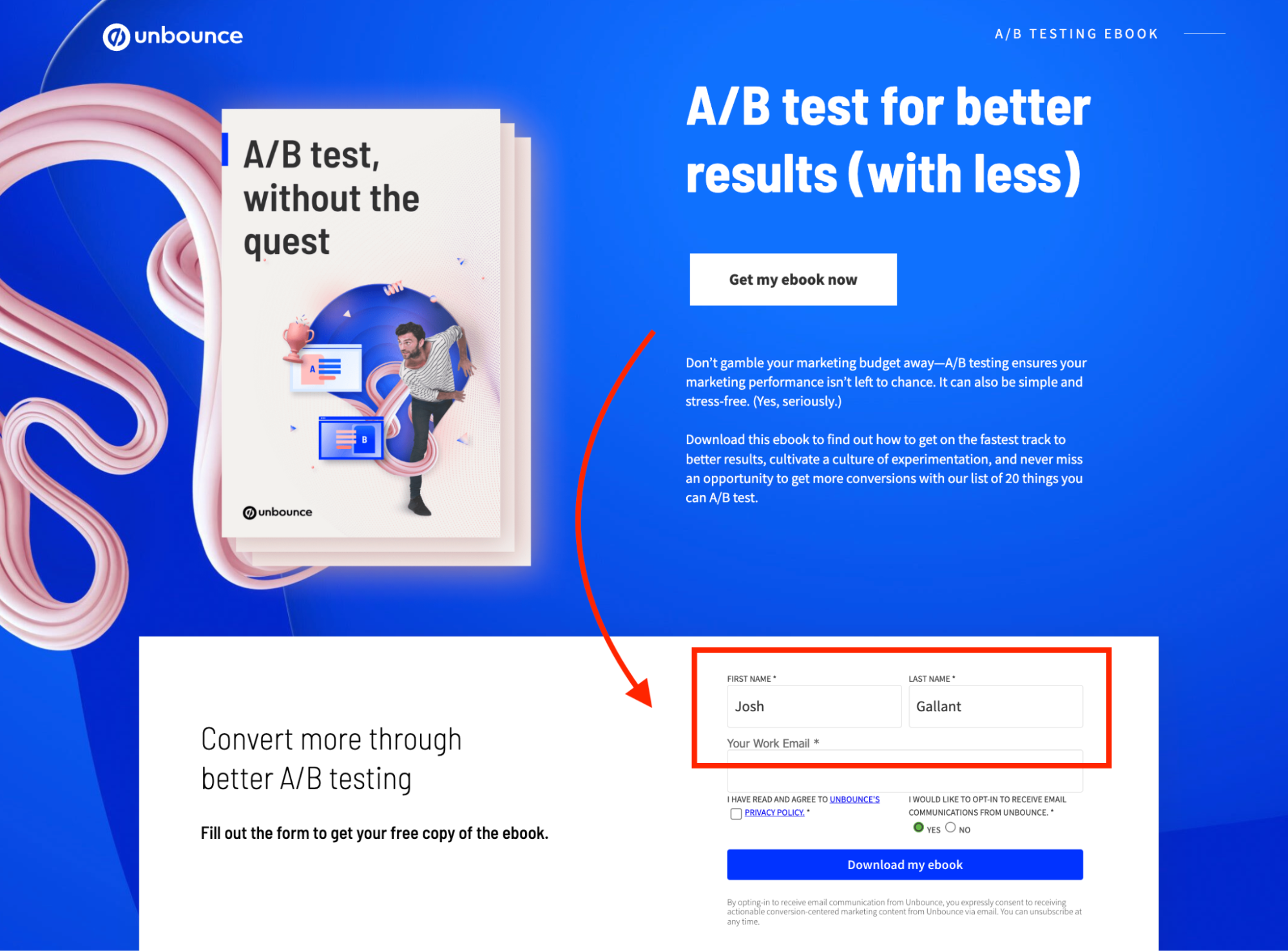
ESpark
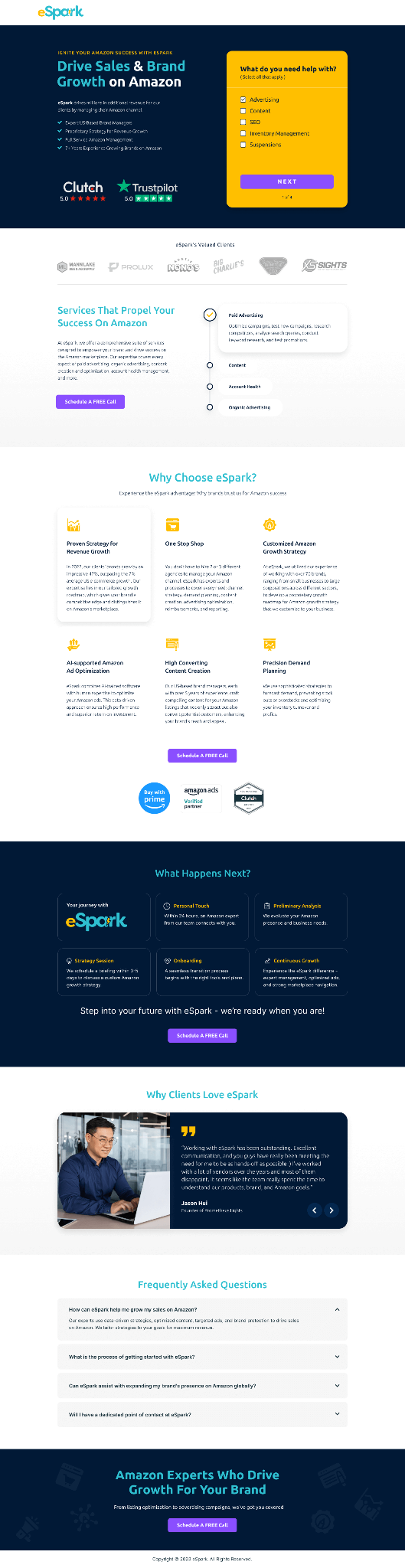
Built for marketing directors evaluating agency partners, this page leads with case study metrics directly above the fold instead of a generic hero image, and pairs that with a simplified form. The logic: marketers are skeptical of polished pitches, so proof comes before the pitch, not after.
Knewhealth
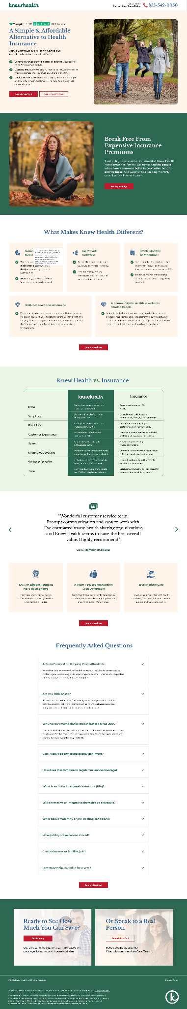
Targets hospital administrators and healthcare decision-makers, a notoriously time-poor, skeptical audience. The page uses a clean, clinical layout with trust signals placed high and a contact form deliberately kept short, since the audience already has low tolerance for friction. Scored 89/100 on Apexure's internal conversion framework, built on Unbounce.
Spark (multi-step lead generation form)
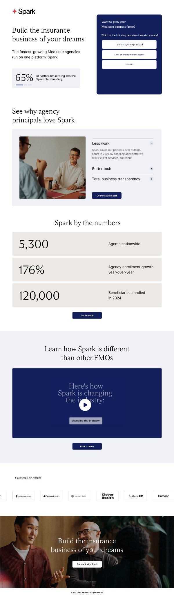
Instead of one long form, Spark's page on HubSpot breaks the form into stages, asking for basic info first and more qualifying detail after the first commitment. This reduces the perceived effort of filling out the form while still letting sales prioritize by the data collected in later steps.
Elite Practice
A click-through page (meaning it builds a case before ever showing a form) aimed at a narrow, specific B2B audience. It uses industry-specific proof points instead of generic testimonials, which matters because a healthcare practice owner trusts a stat from another practice far more than a logo from an unrelated industry.
The pattern across all four: none of them try to convert a cold, broad audience with generic messaging. Each one narrows the headline, the proof, and the form to the exact person landing on the page. That's the real lesson, not the specific layout choices, but the discipline of matching every element to one tightly defined visitor.
Lead Capture Page Templates to Get Started Faster
Rather than just pointing you to a list of template marketplaces, here's a full example template structure you can copy directly and adapt, built around a strategy call offer since that's one of the most common BOFU asks in B2B services.
Example Template: "Strategy Call" Lead Capture Page
Headline:
"See How We'd Book You 10-30 Qualified Sales Calls a Month"
Subheadline:
"Free 20-minute strategy call. No pitch deck, just a breakdown of what your outbound could look like."
Benefit bullets (3):
- See exactly which channels fit your ICP, LinkedIn, cold email, or cold calling
- Get a realistic timeline based on what we've seen work for similar B2B teams
- Walk away with a plan, even if you don't move forward with us
Proof element (placed directly above the form):
"We've helped 10,000+ B2B companies generate $312M in pipeline, including teams at Amazon, Google, Uber, PayPal, Slack, and Spotify."
Form fields (4, matched to BOFU intent):
- Full name
- Work email
- Company name
- What's your biggest outbound challenge right now? (dropdown: not enough leads / low reply rates / no time to manage it / other)
CTA button:
"Book My Strategy Call"
Thank-you page copy:
"You're booked. Check your email for the calendar confirmation, and come ready with your current outbound numbers if you have them, it'll make the call more useful."
This structure works as a template for any BOFU service offer, not just ours. Swap the proof stat, the benefit bullets, and the dropdown options for your own numbers and you've got a page that's already following the right structure instead of starting from a blank canvas.
If you'd rather pull from a library of pre-built options, Unbounce, HubSpot, Leadpages, Instapage, Carrd, and ConvertFlow all maintain free and paid template galleries across these same categories: free resource opt-in, demo request, webinar registration, free trial, and consultation booking.
Just remember the rule from earlier: swap the copy before you touch the design, the template is the skeleton, not the page.
How Cleverly Uses Lead Capture as Part of a Full B2B Lead Generation System
A high-converting capture page is only as good as the traffic you send to it. We've watched teams spend weeks perfecting page copy and form length while the bigger problem was upstream: the outreach bringing people to the page wasn't targeted enough to convert in the first place.
That's the piece we focus on. We run done-for-you B2B lead generation through LinkedIn outreach, cold email, and cold calling, and every campaign we build is tied to a specific offer and a specific landing destination, not generic traffic pointed at a generic page.
When the outreach message and the capture page say the same thing, reply rates and meeting bookings go up, because there's no disconnect between what someone was promised and what they land on.
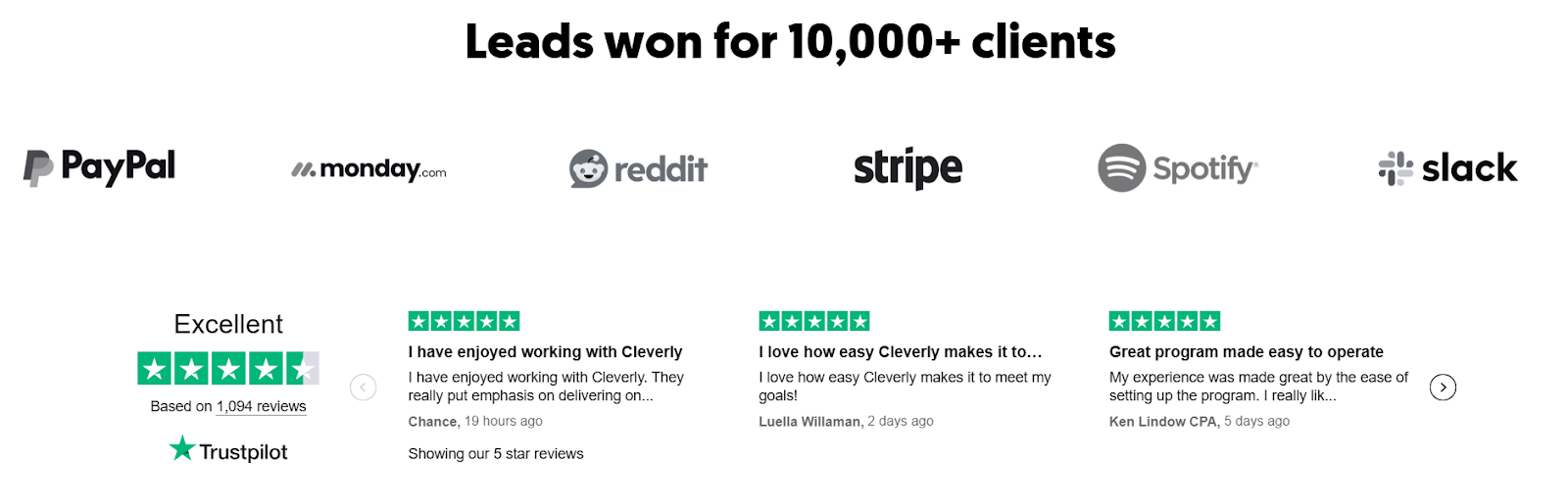
We've run this playbook across 10,000+ B2B companies, including teams at Amazon, Google, Uber, PayPal, Slack, and Spotify, generating $312M in pipeline for clients along the way.
The reason it works isn't the landing page alone, it's that the leads arriving there are already qualified by relevance, because we handle the ICP targeting, list building, and messaging before anyone ever clicks through.
Want a complete system that connects outreach to capture to booked meetings? Book a strategy call with Cleverly and we'll walk you through how it fits your pipeline goals.
Conclusion
A lead capture page isn't a design project, it's a conversion system built around one clear offer. The pages that consistently perform follow the same formula: a relevant offer, focused copy, minimal friction, proof placed near the form, and one CTA with nowhere else to go.
Build it, test it, and keep adjusting. Even pages that convert well today have room to improve, and the teams pulling ahead in 2026 aren't the ones with the best designers, they're the ones who test more and pair their pages with outreach that sends the right traffic in the first place. Get that match right, and the page does exactly what it was built to do.
Frequently Asked Questions
Free Resource
How to Scale a Profitable Cold Call System
Get the complete guide — download it instantly now.
Free Ebook
Download the Free Guide
Enter your details to get instant access.
You're all set! 🎉
Your ebook is downloading now.
Click below if the download didn't start automatically.


